
Mission
To create opportunities to engage in communication on divisive issues with empathy and compassion, seeking understanding rather than simply to be right.
Read more

Our Community
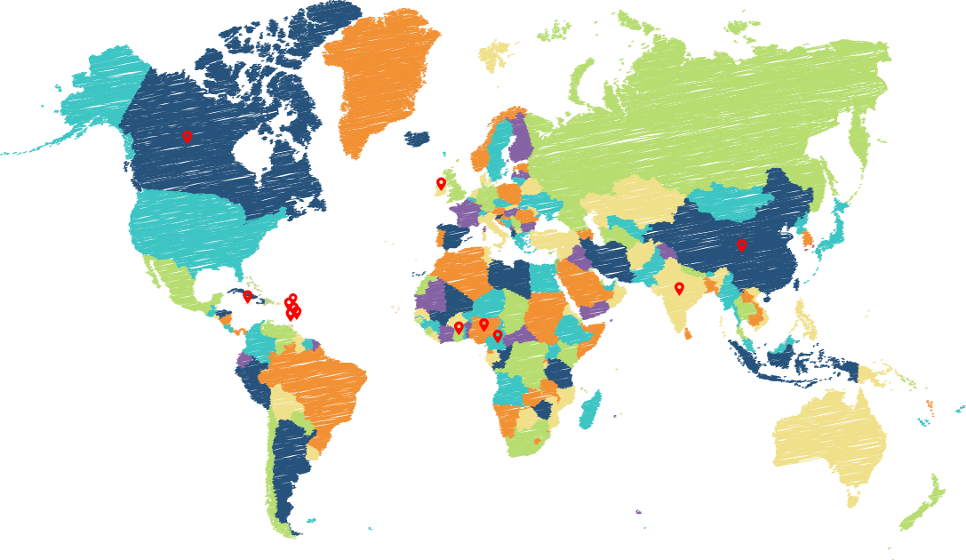
Disclaimer : You Are Familiar With This Map But It Is Inaccurate
Link To VideoWhy the Mercator map is inaccurate and problematic: The Mercator map distorts the size of various countries and it promotes a Eurocentric bias. The Mercator map inflates the size of countries near the poles while shrinking land masses at the equator. For example, it makes Greenland and Africa appear to be roughly the same size, even though Africa is actually 14 times larger. Similarly, Europe is depicted as larger than South America, when South America is nearly double its size. In addition, because of these distortions and the placement of the Northern Hemisphere, Western and European civilization are given visual prominence. The cartographers argue that because people unconsciously equate size with importance, it creates an ethnic bias against the “Third World”
Ali Center Releases Groundbreaking Study on Compassion in America Read More
Visualizing GDP per Capita by Country Read More
The Most Empathetic Countries in The World Have Just Been Ranked Read More
Size Distortion: The Mercator map inflates the size of countries near the poles while shrinking landmasses at the equator. For example, it makes Greenland and Africa appear to be roughly the same size, even though Africa is actually 14 times larger. Similarly, Europe is depicted as larger than South America, when South America is nearly double its size. [1, 2, 3, 4]
Eurocentric Bias: Because of these distortions and the placement of the Northern Hemisphere, Western and European civilizations are given visual prominence. The cartographers argue that because people unconsciously equate size with importance, it creates an ethnic bias against the “Third World”. [1]
Join Our Community
Lorem Ipsum is simply dummy text of the printing and typesetting industry. Lorem Ipsum has been the industry’s standard dummy text ever since
 Youtube
 Facebook